Permissions
You will require an Access Role with the following permissions:
- GreenLight Management (Menu Management)
GreenLight Details
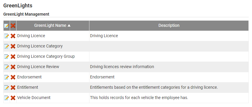
- Navigate from the Home page to Administrative Settings | GreenLight Management | GreenLights. This will display all of the GreenLights which have previously been created within your organisation.
- Click New GreenLight within the Page Options menu. You will be directed to the New GreenLight page where you can start to configure the GreenLight, beginning with the GreenLight Details.

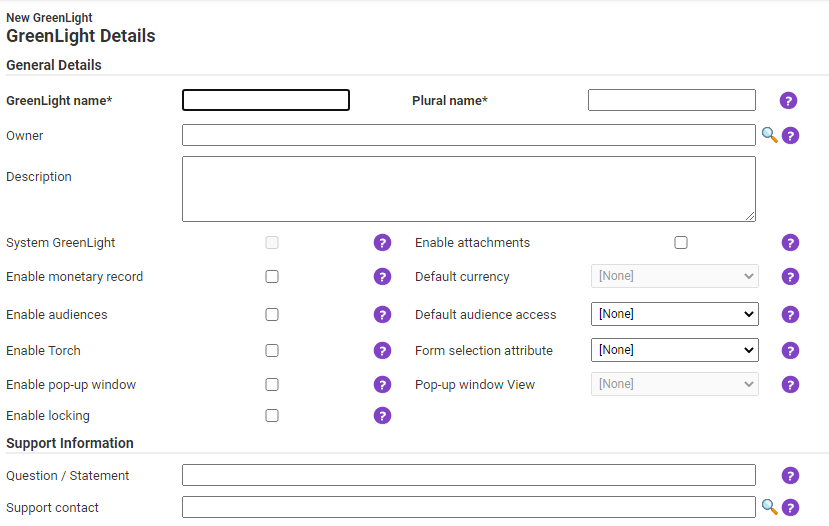
General Details Description GreenLight name Enter the name of the GreenLight that you are creating, for example ‘Leavers Form'. Plural name This is the plural name of the GreenLight. This will be displayed in the column headers, within summary screens, to show the quantity. Owner Enter the name of the user responsible for the GreenLight. Relevant search results will appear after 3 characters have been entered.
You can also click the icon to open the Owner Search modal.
Description Add a description to help users understand what the GreenLight is used for. Enable monetary record You will need to consider if the form will include any financial information or not. You may wish to store currency information, calculations, transaction values or just simple values. If this is correct, select this option.
Note: If selected, the Default Currency option will be activated.Default currency If the record includes financial information, state which default currency the form should use. Select the default currency from the drop down menu.
Note: The Enable monetary record option must be active in order for this option to become active.Enable attachments Allows attachments to be added to the GreenLight. For example, you could upload a copy of the resignation letter against a Leavers Form. Enable audiences Allows you to restrict access, only permitting certain users to access or view the information collated in the GreenLight record.
Note: If selected, the Default audiences access option will be activated.Default audiences access Allows you to select who a GreenLight is visible to, until an audience has been set. Select who the default access applies to from the drop down list.
Note: The Enable audiences option must be active in order for this option to become active.Enable Torch Enables you to generate a final report containing all of the information collected through the GreenLight.
Note: This option is only available to customers licenced for Torch.Form selection attribute Select one of your permitted attributes, once created, to use as a form selector from a view. This allows you to present a different form to a user depending on the value of this attribute. Enable pop-up window This option will allow you to enable a GreenLight view to be displayed in a new pop-up window when used as a one to many relationship with another GreenLight.
Note: If selected, the Pop-up window view option will be activated.Pop-up window View Use this drop-down list to select the GreenLight view to be used in the GreenLight pop-up window.
Note: The Enable pop-up window option must be active in order for this option to become active. Until you have configured a GreenLight view, the drop down field will be populated with [None]. For information on creating a GreenLight view the GreenLight Views tab at the top of this article.Enable locking If enabled, the GreenLight will only be editable by one user at a time.
For example, If User A attempts to access a GreenLight which is currently being accessed by User B, a notification will display for User A to inform that the GreenLight is in use by User B. The GreenLight record will automatically unlock when it is no longer in use.
User A will still be able to view a Read-Only version of this GreenLight record by clicking close on the locking notification, but they will not be able to interact with it.Support Information Description Question/Statement Allows you to define a question or statement that will appear in the Online Help page. If a user selects this question/statement from the list on the Online Help page, they will be directed to raise a support ticket. Support contact In conjunction with the Question/Statement field, you can select a user for the GreenLight support ticket to be sent to. When a user selects the support question/statement, they will be prompted to raise a support ticket which will be directed to the Support Contact. If this field is left blank, the support ticket will be directed to the Main Administrator. - Once this information has been completed the GreenLight can be created by clicking Save. Alternatively, continue to create the GreenLight attributes. For more information, view the GreenLight Attributes tab at the top of this article.
GreenLight Attributes
Each GreenLight that you create will require attributes (fields). An attribute is primarily a field that allows you to collect information from a user when they are filling out a GreenLight form. Attributes are used to collect different types of information based upon the attribute type which is selected and when used alongside other attributes they create a fully functioning digital form. To create a single attribute, follow the steps below:
- From within the GreenLight, click Attributes within the Page Options menu. Any existing attributes for this GreenLight will be visible. From this list, any existing attributes can be amended
 and deleted
  .
.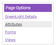
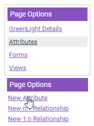
- Click New Attribute located under the secondary Page Options menu. A modal will display which allows you to create the new attribute.
Note: When you create the first attribute you are provided with a list of default attributes, shown on the image below.
- Complete the following details:
Field Description Display name Enter the name of the attribute. Description Enter a description to help differentiate between attributes. This is particularly useful if you have a large amount of attributes configured. Tooltip Customise the tooltip text which will be displayed to the user for this attribute. This should be a section of helpful text which will assist users to enter the correct information. System attribute A System GreenLight attribute contains functionality which is required for a specific feature to work correctly. It cannot be deleted. Mandatory Specify if this attribute should be mandatory in all forms where used. This option can be overridden on specific forms by editing the form design. The form settings take priority over the attribute settings. Used for audit In order to identify any changes made to the GreenLight through the Audit Log, the most appropriate attribute needs this option activated.
Note: Only one attribute can be selected for each GreenLight. When the Audit Log is generated, each change to the GreenLight is recorded and will be identifiable by the Attribute Name that this is activated for.Unique Define whether the data entered for this attribute will be unique for each entry. For example, if a user name is to be entered, duplicate user names will not be permitted. Display in mobile app Note: This option is not currently supported. 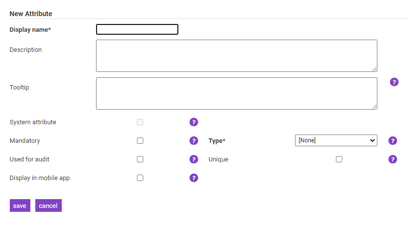
- Once the General Details have been configured you will need to define the Attribute Type which will be used to collect the information:
Attribute Type Description Text Allows a user to enter text into the field.
Specify whether the format of the field will be Single Line or Multiple Line.
Specify the Maximum Length of the field (number of characters).
Select the 'Encrypt' check box to encrypt the data stored when saving the attribute. This will add an extra layer of security to protect any personal or sensitive information.Integer Allows a user to enter a number into the field. Decimal Allows a user to enter a decimal number into the field.
Use the Precision field to specify the number of decimal places after the decimal point. Up to nine decimal places are permitted.Currency Allows a user to enter a monetary value, up to two decimal places. Yes/No Allows a user to select Yes or No from a drop-down list.
Specify whether the default value should display as Yes or No.List Allows a user to select information from a drop down list. You must specify the values to show within the list.
Use the icon to add an individual item which will be populated within the drop down list.
Click a list item and then click the icon to remove that item from the list.
If you need to keep the list item, but it is no longer required, click the icon and set the field to Archived.
Date Allows a user to define a date.
Specify if the field should be Date Only, Time Only or Date & Time.Large Text Allows the user to enter a large amount of text.
Specify whether the format of the field will be Multiple Line or Formatted Text Box.
Specify the Maximum Length of the field (number of characters).
Select the 'Encrypt' check box to encrypt the data stored when saving the attribute. This will add an extra layer of security to protect any personal or sensitive information.Comment Allows you to specify a comment which is displayed on the form. This may be instructions which can be placed anywhere on the screen to provide further information and guidance to the user. Attachment Allows a user to upload an attachment from their local network/computer.
Enabling the Image Library option will allow the user to attach images from the default image library as well as their own file system.Contact Allows a user to enter contact details.
Select the format of the attribute by selecting Email, Phone or SMS.
Select the 'Encrypt' check box to encrypt the data stored when saving the attribute. This will add an extra layer of security to protect any personal or sensitive information.- The image below shows how some of the different attribute types could look when placed on a form:
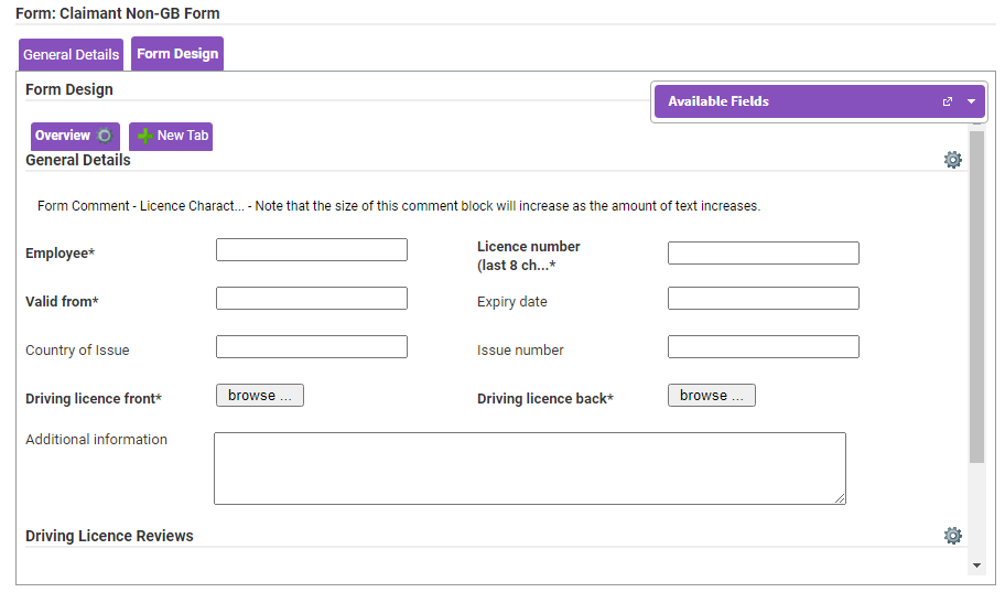
- The image below shows how some of the different attribute types could look when placed on a form:
- Hovering over a an attribute will display options for changing the placement, appearance and function. In this options menu you will also be able to set that field to mandatory.
- Click Save to store the attribute or click Cancel to discard any changes. You can repeat this process to create multiple attributes which can be used to create a GreenLight form. For information on creating a GreenLight form, view the GreenLight Forms tab at the top of this article.
GreenLight Forms
Note: You will need to have defined all of the attributes and relationship attributes prior to this step, in order to build the GreenLight form.
- From within the GreenLight, click Forms located under the Page Options menu. This will display any current forms which have been created.
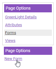
- Click the New Form link located under the secondary Page Options menu. This will display a modal that contains the relevant fields to be completed to construct the form.
- Complete the following General Details:
General Details Description Form name Enter the name of the form that you are creating. Description Enter a description to define the purpose of the form and how it differentiates from other forms. System form A System GreenLight form contains functionality which is required for a specific feature to work correctly. It cannot be deleted and will likely contain attributes which cannot be deleted. Show sub-menu Determines whether to display the Page Options menu. Show breadcrumbs Displays the breadcrumb navigation menu at the top of the page. This helps the user to determine their location within the GreenLight and provides a way to trace the path back to their original starting point. Hide Torch Hides the Torch tab.
Note: The Torch tab will only be accessible for organisations who are licenced for the Torch feature.Hide Attachments Hides the Attachments tab on the GreenLight record Hide Audiences Hides the Audiences tab on the GreenLight record 
- The form must contain at least one of the following action buttons. Default action buttons have been created which can be customised.

Option Description Text for save button Saves the changes made on the current record and directs the user back to the summary screen.
Enter the text that you want to display for this button, for example OK, Next or Submit.Text for save and duplicate button Saves the changes made on the current record and generates a duplicate record for completion.
Enter the text that you want to display for this button, for example Save and Replicate.Text for save and new button Saves the changes made on the current record and generates a new record for completion.
Enter the text that you want to display for this button, for example Save and Next.Text for save and stay button Saves the changes made on the current record but the content will remain visible on the screen. This may be of use while working on a large document so that you can save changes as you continue working through the form.
Enter the text that you want to display for this button, for example Quick Save.Text for cancel button Cancels any update to the record and takes the user to the summary screen.
Enter the text that you want to display for this button, for example Quit or Back.
Once you have defined the General Details of the form, you can move on to the Form Design. - Click the Form Design tab at the top of the modal. This is where you can change the layout of the form and how the finished GreenLight will look to the user. The structure of a form is as follows:
- A form can have one or more tabs.
- A tab can have one or more sections.
- A section can have one or more attributes.

Tip: Once you have defined the tabs and sections on the form, you can create or change the design with the drag and drop builder. Hold on to any tab, section or attribute using the left click of the mouse, drag and drop to the new location.
- A form can have one or more tabs.
Adding a Tab
- From within the Form Design tab, click the New Tab button (alternatively press Ctrl+1 on your keyboard).
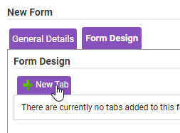
- Enter the tab name in the modal which appears and then click Save.

- This will create the tab which will be displayed on the form. You will then be able to create sections on this tab, for example on the Employee Details tab you could create a Contact Details section.
- To edit the name of a tab click the
 icon located next to the tab name and then click the
  Edit Tab Name option.
 - To delete a tab click the
 icon located next to the tab name and then click the
  Delete option.
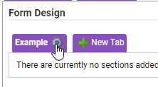
- To edit the name of a tab click the
Adding a Section
- Click on the
 icon next to the tab name (alternatively you can press Ctrl+2 on your keyboard).
 - Click on the
 icon labelled New Section.
- Enter the section name in the modal which appears and then click Save.
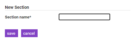
- This will create a section which will be displayed on the form. You will then be able to add attributes to this section, for example on a Contact Details tab you could add attributes for email address and phone number.
- To edit the name of a section click the
 icon located in the section header and then click the
  Edit Section Name option.
 - To delete a section click the
 icon located in the section header and then click the
  Delete option.
- To edit the name of a section click the
Adding an Attribute
- To display the available attributes which you have created you will need to open the floating Available Fields bar. Click the arrow to expand and collapse the menu. The Available Fields bar can be moved around the page by clicking the header and dragging it to a new position.
- Click the
 dock icon on the floating Available Fields bar to dock it to the right side of the screen. This will also expand the menu.
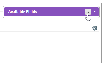
- Click the
- Click and drag an attribute from the Available Fields bar into the correct section on the form. You can move the position of an attribute on the form by clicking and dragging it into another position. You are also able to enter a Spacer which creates a gap between the attributes.
- Hovering over an attribute on your form will display a bar with more options. This will allow you to:
Icon Description 
Move the attribute left 
Move the attribute right 
Edit filters on the attribute 
Allows you to add parent filters to attributes. Multiple parents and multiple children can be used as required.
For example, if your organisation had the following n:1 attributes created:- Vehicle Make
- Vehicle Model
- Employee Name
- Username
This would allow you to set the Vehicle Make and/or Vehicle Model attributes as the parent filter(s) to the Employee Name and/or Username. When selecting a Vehicle Make and/or Model on the form, this would filter the list of Employees and/or Usernames as configured.
Note: If you select more than one parent filter, all filters would have to be applied in order to return results.
Note: This feature is only applicable to n:1 relationships where the 'Related to' field of each is linked within the product.
Make this attribute mandatory to complete on the form 
Remove the mandatory status on this attribute 
Edit the attribute label text 
Mark the attribute as read only 
Define the default text for the field 
Delete the attribute 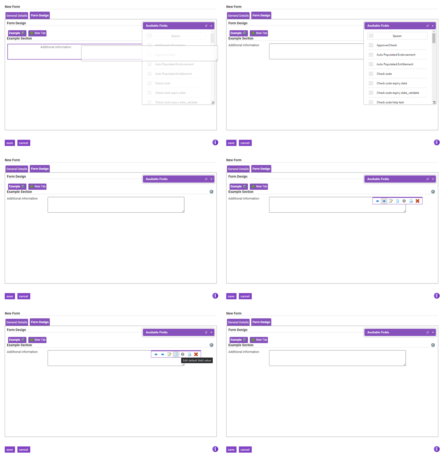
- Hovering over an attribute on your form will display a bar with more options. This will allow you to:
- Once you have finished designing the form, click the Save button at bottom of the modal.
GreenLight Views
Once you have created your GreenLight form you can customise the visibility. Using the views feature you can control where the form is placed and who can view it.
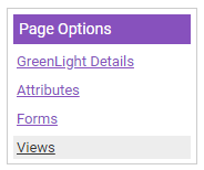
- From within the GreenLight, click on the Views link located under the Page Options menu. This will display any current forms which have been created.
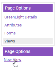
- Click the New View option located under the secondary Page Options menu A modal will display which contains the relevant fields to be completed in order to create the view.
- Configure the view using the following fields and options:
Field Description View Name Enter the name of the view that you are creating. Description Enter a description to define the purpose of the view and how it differentiates from other views. Menu Select the menu that the GreenLight view will be displayed on.
Click the icon to open a window which will display each of the menus available within the product. This will also include any custom menus which have been created. Click a menu with an
  icon to expand and display any sub-menus underneath.
Click on the menu that you want to add the view to and then click Save. For more information on creating a custom menu, view the Custom GreenLight Menu tab at the top of this article.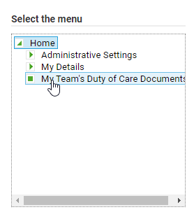 If you want to remove a menu after you have selected it, click Clear Menu.
Note: A GreenLight must activated within a user's Access Role in order for it to be enabled within a menu.Menu Description Enter a description outlining the purpose of the GreenLight view. This text will be displayed alongside an icon on the menu that you select. (Product) This option is only applicable if you are licenced for more than one product.
A check box will display for each active product that your organisation is licenced for. By default, the GreenLight view will display on each active product. Untick the relevant check box to prevent the GreenLight view from being accessible in that product.Default Add Form When adding a new GreenLight record, if a specific form has not been selected, the user is taken to the Default Form chosen from this drop-down menu. Default Edit Form When editing a new GreenLight record, if a specific form has not been selected, the user is taken to the Default Form chosen from this drop-down menu. Allow Delete Allows a GreenLight record to be deleted from within the view, when applicable. When inactive, no delete button will be visible. Allow Approval Activates an extra option for the view which allows direct approvals. - Once you have specified the General Details, you can use the following tabs to customise the view further:
Columns
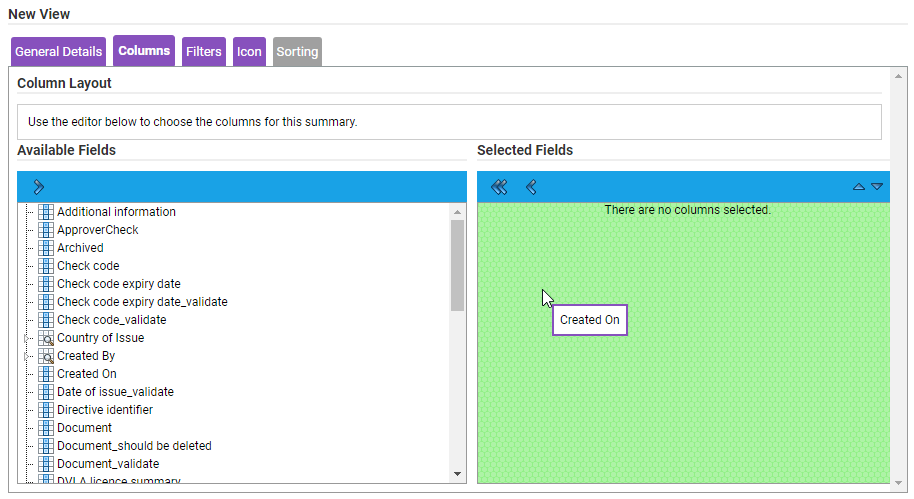
Specify columns that will display, within the view, to help you locate a particular record from the list of existing records.
- Click the Columns tab.
- Drag and drop a field from the Available Fields section into the Selected Fields section to add it as a column. Repeat for each field that you want to add as a column.
- You can use the

 arrows to change the order that the columns will display on the grid.
- You can use the
Filters
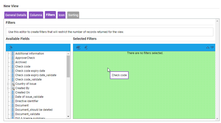
Specify filters that will limit the number of records which are returned in a GreenLight view.
- Click the Filters tab.
- Drag and drop a field from the Available Fields section into the Selected Filters section to add it as a filter.

- Once you have selected a filter you will be presented with a pop-up window where you can specify how you want to filter the records by the field you have just selected.
- Repeat for each field that you want to add as a filter.
Icon
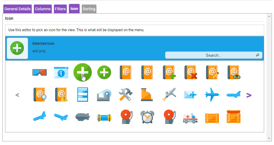
Associate an icon to represent the GreenLight view. This will help to differentiate between views, particularly if there a numerous views in one location.
Note: An icon is not required if this GreenLight is to be used as a relationship onto a parent GreenLight.
- Click the Icons tab.
- Browse through the images by clicking the left and right arrows or use the search bar to locate a specific icon.
- Click on an icon to display it within the preview bar.

Sorting
Define how the information from the columns is displayed within the GreenLight view.
Note: You must specify at least one field within the Columns tab in order to access the Sorting tab.
- Use the Sort Column field to select the column that you want like to sort the information by. The columns available within this drop down field are determined by which fields have been selected in the Columns tab.
- Use the Sort Direction field to select the direction that the information is displayed in. You can specify Ascending or Descending.

- Once you have specified each of the details for this view, click Save on the modal. This will then create the view on the product menu that you have specified.


 icon to open the Owner Search modal.
 and deleted
  .
.


 icon to add an individual item which will be populated within the drop down list.


 icon located next to the tab name and then click the
 icon labelled New Section.


 icon to expand and display any sub-menus underneath.
 If you want to remove a menu after you have selected it, click Clear Menu.
 arrows to change the order that the columns will display on the grid.